Dead, But Should They Stay That Way? The Design Styles Our Team Wants Back
Simply click and drag your
cursor over a passage of
text from the article below
to tweet or share.
Written by: Dylan & Hamish
Edited by: Ed
It happens in fashion. Music, too. Trends work in cycles, and every few years, something we thought we’d laughed out of the room, never to be seen again, comes strolling back in. Hold on, didn’t we swear we wouldn’t ever go near that particular idea again? And yet here it is, making itself at home and putting its feet up on the couch. This happens in design too, except designers tend to have much stronger opinions about what gets banished and what stays that way.
But however firmly we show an idea out, we don’t lock the door behind it. If anything, the door revolves. So, with that in mind, we asked two of our designers, Dylan and Hamish, which design styles they wouldn’t mind seeing make a comeback. There’s Poland, there’s paintbrushes, there’s contrarian takes. Not necessarily in that order.
Dylan – Corporate Memphis
Alright, hear me out. I hate Corporate Memphis, and that’s exactly why I want it to come back.
Yes, my sentence tripped over its own feet there, but let me explain. If there’s one thing most design styles and trends have in common, it’s that they all died out or became less interesting the moment some companies started using them too. There’s a common belief online that a meme isn’t truly dead until big brands get their hands on it. I believe the same applies to design.
The thing is, Corporate Memphis wasn’t born ugly. If anything, it was tolerated as part of Facebook’s rebrand. It was only when it was adopted more widely that the backlash started, and the style began copping some flak.
But that’s its value, isn’t it? If Corporate Memphis were to come back, it wouldn’t be the worst thing in the world. All brands need a design style, and the boring ones can have Corporate Memphis. Let it take the hit – if these less adventurous companies are using it, they’re leaving the more interesting designs untouched.
Besides, in an age where the tide of AI slop is rising, and mass design production churns on, I think we’d prefer the devil we know. So yes, bring back Corporate Memphis – it’s better than the alternative.
Hamish – Commercial Illustration
The world of design is fast-paced, and there’s nearly always a tight deadline you’re butting up against. Luckily, programs such as Adobe, Figma and Affinity have made creating artwork easier than ever.
However – and it’s a big however, with flashing neon lights and sirens – there’s an itch these programs just don’t scratch. There’s something special about handcrafted work that makes it stand out – the craft, the work, the time, thought and consideration. That’s why I think commercial illustration needs to make a comeback.
Commercial illustration peaked in popularity during the 70s and 80s, before digital software came along and dominated the industry. Using airbrushes, gouache and acrylics, artists could create clean, character-filled artwork that told an imaginative story.
In a world overwhelmed by flat minimalism, AI slop and generic digital templates, artwork made by human hands feels more authentic and meaningful. The time, skill, and personality behind every detail make these pieces stand out in our modern visual landscape.
Look at publishing – where much of that industry has shifted to solely digital production, MAD Magazine has proved this style can live on. Its visual identity remains distinctive, preserving the nostalgic charm and human touch that makes its designs iconic.
Dylan – Polish School of Posters
Enough with the floating heads! There’s nothing worse than seeing six floating Hollywood actor heads, all jammed onto one poster at once. As a film nerd and graphic designer, I deeply admire a good film poster – and that’s exactly why it hurts to look at so many of them. If I could bring one design style back, it would be the Polish School of Posters.
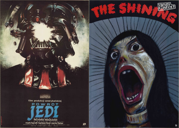
The style originated in Poland, where it became known for its use in abstract film posters. Compared to their Western counterparts, the designs are far more interesting to look at. Rather than lining up a glamorous cast, they take a conceptual approach which encourages the viewer to think more deeply.
This feels overdue. At a time when imagery seems to be about being as obvious as possible, it’s good to have room to form our own opinions and interpretations. It’s bad enough when we get the entire movie in a two-minute trailer – we don’t need the poster taking the same route.
The timing is right, too, especially with Gen Z proving to be such a driving force behind cinema attendance. Lots of Gen Zers care about film, and many consider it a primary interest. I’d argue that there’s never been a clearer time for movie posters to up their game.
Want proof? Look at Letterboxd – one of the main reasons people pay for it is to get custom movie posters that show off their top four films. Posters have long been considered an afterthought in film promotion. But for these audiences, an eye-catching, less obvious design is all part of the appeal, and is something designers can take on board elsewhere.
What’s Coming Back Next?
Three very different styles there, but all pulling on a common thread. Whether it’s a safe corporate design choice, an illustration you can tell someone spent time on, or a Polish poster style that forces you to think, each pushes back against the idea of everything looking the same.
That’s something we care about at UMM, where our creative work continues to be human-made, with all the opinions that entails. Looking to get beyond floating heads, the overly obvious, or something hot off the template conveyor belt? Come chat to us today.
