Rothsay Rebrand
Tags
Creative
Simply click and drag your
cursor over a passage of
text from the article below
to tweet or share.
OBJECTIVES
There were four main objectives of Rothsay’s rebrand: strengthen their image as a ‘market-leading, medium-sized Chartered Accounting firm’; increase market penetration to new and existing clients; humanise the Rothsay brand; and increase brand consistency across all platforms and channels.
″The logo is perfectly balanced, much like a ledger.″
STRATEGY
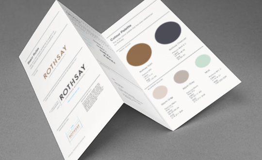
In the audit phase, UMM defined four key brand pillars in Rothsay’s business model that defined their USP in the market. This quartet of pillars were: Stability; Experience; Evolutionary; and Humanistic. The brand that was developed included logo design, corporate colours, typography, and stationery rollout.

- Integrated creative agency. The revamped Rothsay website.
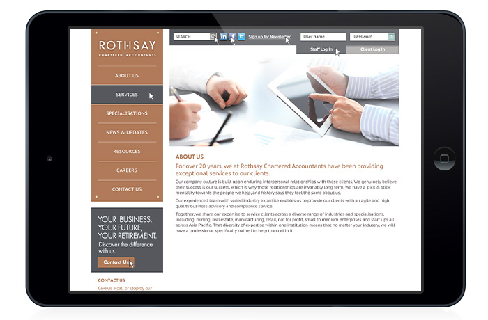
- Integrated creative agency. The new site, as viewed on tablet.
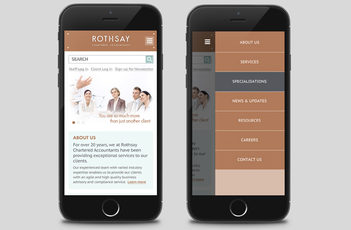
- Integrated creative agency. The new site, optimised for mobile.
RESULTS
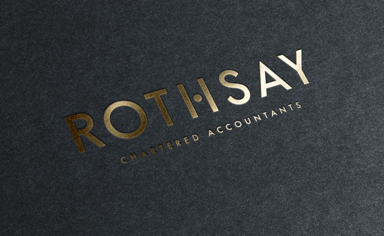
In accordance with the objectives and strategy of the rebrand, the ‘H’ in ‘ROTHSAY’ has been modified to feature a dot in place of the existing crossbar. On the face of it, this creates a visually interesting and unique logo.
As an extension of the brand, the dot exists at the exact centre of the logo, in order to demonstrate that the logo is perfected balanced, much like a ledger.
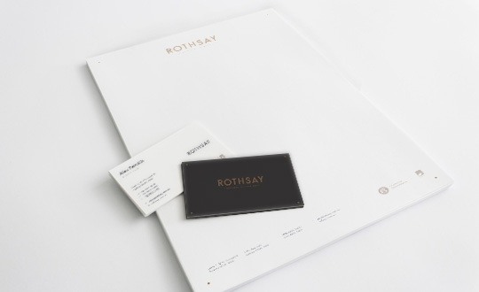
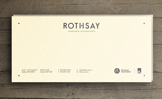
With regard to the business cards and stationery, the four dots in the corners act as a graphic device that can be used on different touch points of the brand to represent Rothsay’s four key brand pillars.