PAG Identity
Tags
Creative
Simply click and drag your
cursor over a passage of
text from the article below
to tweet or share.
BRIEF
Following a successful PR project conducted by UMM, PAG’s brief came in two parts:
1. Create a brand that would cement its position as a highly progressive local company and the largest health insurer in PNG.
2. Amplify the announcement of the new brand to the media and public.
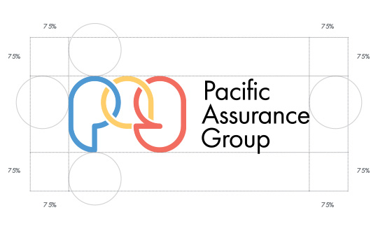
″The logo was formed by interlocking the abbreviated letters of Pacific Assurance Group together like chain links. This communicates strength, dependability and integrity.″

STRATEGY
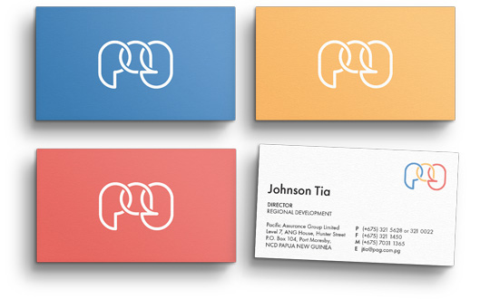
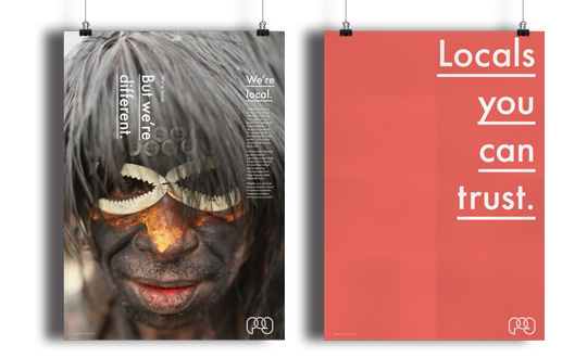
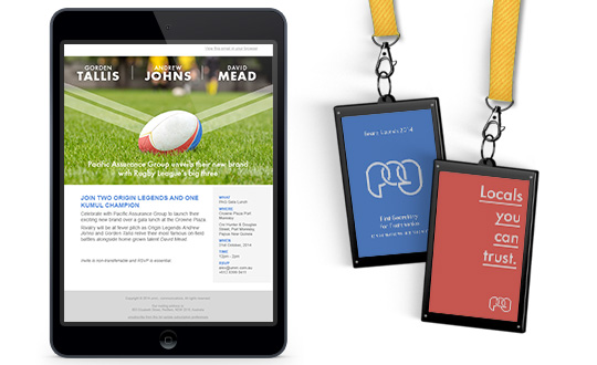
UMM set about creating a corporate identity for PAG, including logos, iconography, typography, colour palette, image library, and stationery that would embody the newly developed brand ethos. We were also asked to create event collateral, encompassing media board, event banners, fliers, invites, lanyards, posters, and EDMs.
In addition to this was the design of a suite of brochures and the conception of PAG’s first-ever website – one responsive to mobile devices.
The brand was launched through a multi-layered event activation that incorporated a footy clinic, media press conference, and a VIP launch event with highly reputable brand ambassadors.
LOGO
The logo was formed by interlocking the abbreviated letters of Pacific Assurance Group together like chain links. This communicates strength, dependability and integrity.
The outlined letterforms signify openness and transparency, while each letter being a different colour shows diversity in PAG’s communities and in how they support them.
COLOUR
The colours used were a progression from the existing PAG colours, as requested, but also introduced a new colour to mark a new era for the company. Blue was retained as a colour of trust; yellow was incorporated as a positive visual. The new colour, red, was introduced to underline the proudly local nature of this 100 per cent nationally owned company. It is a visual that is strikingly synonymous with the PNG national colours.
